To get the most out of your marketplace, you need to consider not only your personal preferences, but also the convenience for users. However, it often happens that a visitor enters a website in order to buy a particular product, but does not perform a targeted action.
One of the most likely reasons could be a complex, awkward, or incomprehensible product page. Therefore, designing product pages for marketplaces should consider the best practices and include all the necessary elements. We will tell you how to quickly improve the product page. Follow the formula “Simple+Convenient+Useful=Purchased!”
What should be included on a product page for a marketplace
The main elements of a product page are:
- A descriptive product name
- A recognizable product image
- Pricing, unique selling proposal, payment and delivery options
Product page name
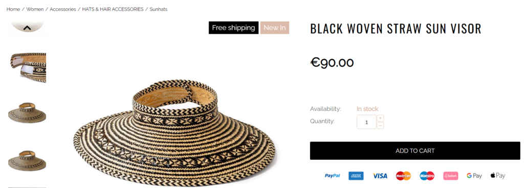
The name of the product should catch the eye so that visitors could immediately realize they are on a page of a product they need. A modern person uses the Z-shaped pattern when viewing the product name and description. This pattern means that a person reads from left to right with the eyes first on the upper left corner. It is this place that will be optimal for the product name.
The design should be such that you can enter a long name displayed correctly. This pattern has its advantages:
- If the product name is long and descriptive, a customer won’t need to do an additional search for important information
- It is easier to search for a product
- The presence of the brand in the name allows you to play on its relevance
Product image
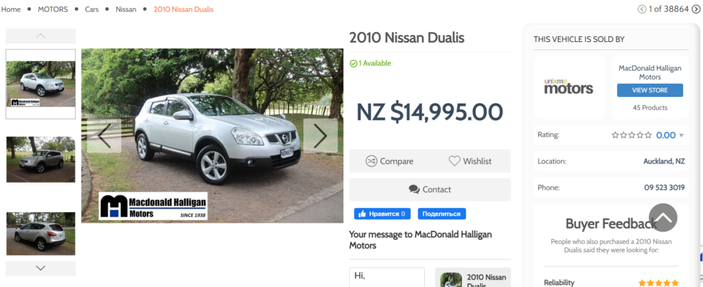
A high-quality picture not only attracts attention, but also tells about the product more than a detailed text description. Therefore, you should always try to create the perfect product page for marketplaces with high-resolution photo quality.
You should provide your customers an opportunity to view the product:
- In real conditions: in order to have an idea of its size, appearance, etc.
- From each side: this is the only way to learn in detail about the product texture and color.
This can be done by setting up a 3D view, zooming in on the picture, and adding a photo of the product in a real environment.

Responsive design
Each element on the product page should be tailored for the convenience of the visitor and be adapted to any device. This is done in order to maximize the conversion and bring the user to the final goal, the purchase of your products.
Product page usability: it should be clear
There are a number of elements that make getting to know and buying a product easier.
In Stock label
The design of the product page for the marketplace should ultimately inform the user about the availability of the product in stock. This gives them confidence that they won’t have to wait long for delivery. You can simply inform visitors that the product is in stock, or indicate its quantity in stock.
Special offers and promotions
If the product is on sale, you should specify:
- Product regular price
- Promotion price
- How much can a customer save
Product size chart
When selling clothes and shoes, a size table should be present on the product page. This element should match the product and not open in a separate window to ease viewing.
Choice of options
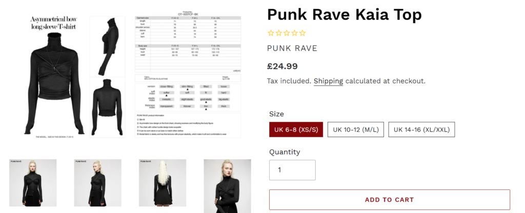
If there is a large product assortment, it is necessary to provide a choice for the customer without the need to go to another page. You can do this in the form of checkboxes or dropdown lists. This option has the following advantages:
- Ease of navigation through options
- Efficient search in store
- Attracting a visitor with photos in the catalog
- Understanding of the product range
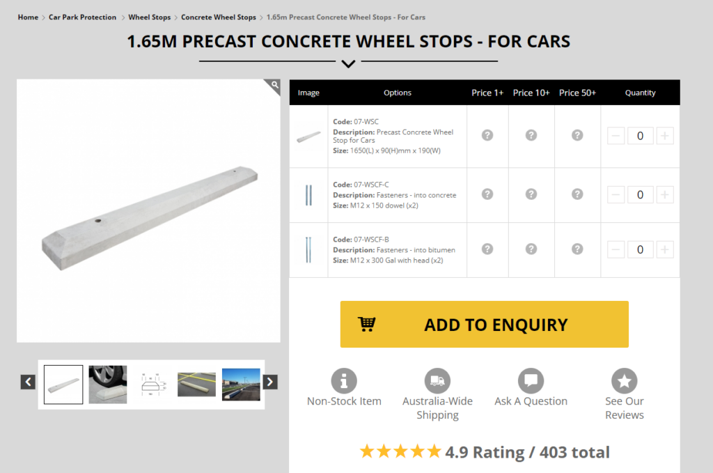
Delivery, warranty, and returns
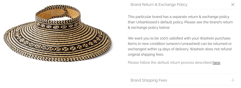
By specifying detailed information on delivery options, warranty and returns on the product page, you make the customer more confident about the purchase. It is important that he or she knows not only the delivery time, but also the cost with the help of the delivery cost calculator.
Additional elements of a marketplace product page
When the user is ready to order the product, always recommend making another purchase. For this purpose, the product page should additionally contain such elements as “You may also like”, “Popular products”, etc. In this way, you can increase the average order amount. Adding end-to-end blocks with seasonal products allows you to focus on specific products and increase conversions.

Product page reviews and details
To make the product page for the marketplace as customer-oriented as possible, you need to supplement it with reviews and detailed information. Positive reviews and ratings push a person to buy, because if someone orders it, then “I need it too.” It is necessary to make sure that the product page contains the detailed description, and it is not taken out separately.
The Simtech Development team will help you quickly adapt the product page to current trends, optimize the current design, add new blocks, drop-downs or pop-ups to reduce the number of abandoned carts and increase conversion.
