To get the most out of a marketplace, you need to consider not only your personal preferences but also the convenience for users. However, it often happens that a potential buyer visits your website in order to buy a particular product, but does not perform the targeted action. One of the most likely reasons could be a complex, awkward, or incomprehensible product page. We will help you quickly improve the product card following customer preferences and market trends.
What Is a Product Page on a Marketplace?
A product page is a page or block of information that contains description of the product, its images, price, availability info, customer reviews and ratings. The product card provides potential buyers with information about the product and allows comparison with other similar products. As a selling tool on the marketplace, it should be informative, attractive and easy to use.
The product page usually contains the following information:
- Product name
- Product description
- Product image or video
- Price of the product
- Availability of goods
- Product characteristics (size, color, material, etc.)
- Customer reviews
- Product rating
- Terms of delivery and return of goods
Additionally, you can include information about the seller and their rating, video reviews and other elements upon request.
Product page helps shoppers compare different products/services and make purchasing decisions. It is also an important tool for merchants to present and promote their product to a wide audience.
What Is an Infographic for a Marketplace?
Increasingly, online marketplaces developers recommend using infographics instead of traditional images and text descriptions. A marketplace infographic is a visual tool that presents information about products, services or other data related to a product in a convenient and attractive way. It combines text, graphics and diagrams to convey complex information in a more comprehensive way.
Marketplace infographics should be easy to understand, informative, and aesthetically pleasing. It can be placed on the marketplace website, used in advertising materials, social networks and other communication channels.
Marketplace infographics can be used for:
- Product and service presentations: Infographics help present information about products and services, such as features, benefits, prices, and so on. This helps shoppers make an informed buying decision.
- Statistics and data visualizations: Infographics are used to visualize statistics and data about sales (Ordered over 1,000 times), user behavior (Bestseller), ratings and reviews, etc.
- User education: Infographics educate users on how to use a product, how to place an order, how to leave a review, etc. This can simplify the process of using the marketplace for newcomers.
- Marketplace promotions: It can be used to promote the marketplace, attract new buyers and sellers. Infographics help highlight the benefits and unique features of the marketplace, grab attention and spark interest from potential customers.
Apart from infographics, modern product pages should also include rich content. Rich product card content refers to a variety of formats and types of content that can be used to capture consumer attention and increase conversions. For example, high-resolution images, videos, animations, interactive elements, 3D models, customer testimonials, and other elements that make the product offering more attractive and informative. It can also help improve search engine optimization and rankings, as search engines often prefer pages with more varied and informative content.
Why You Need to Complete the Product Page Correctly
The correct completion of your product page is very important, as it can have a direct impact on various aspects of sales. Here are a few reasons:
- Identification and Communication: It contains information about a person, product or event. The correct filling of the card helps to identify and associate this information with the appropriate subject.
- Data Accuracy and Reliability: Proper completion of the product page guarantees the accuracy and reliability of the data. Incorrectly filled in data can lead to misunderstandings or incorrect conclusions.
- Simplified Processes: A properly completed product page helps streamline various processes such as processing applications, analyzing data, or conducting research. Correct information allows you to use resources efficiently and reduce the time spent on correcting mistakes.
- Security and Privacy: Proper completion of the product page may involve security and privacy issues. For example, an incorrectly completed drug product page can lead to wrong diagnosis or treatment.
- Improved communication: The product page is the primary means of communication between you and your customer. Completing the card correctly helps ensure that the information is comprehensive and coherent, which contributes to more effective communication.
Basic functions of a product page for a marketplace
The main functions of the product page include:
- Inform about the name of the product with a title
- Give an idea of the product appearance with product photos
- Give additional information: block with price, USP (Unique Selling Proposition), delivery and payment options
- Provide an opportunity to find what you need with the help of parameters: size, color and other options.
Let’s take a look at 11 main ingredients of a perfect marketplace product page.
Title with the product name
The name of the product should immediately catch the eye. Today’s consumers, as a rule, use the Z-reading technique to view the title and description of a product. The method involves reading from left to right from the upper left corner. So this place will be optimal for the title.
The design of product pages for marketplaces should allow for entering a long name that could be displayed correctly. This has its advantages:
- The presence of details in the title does not require additional search for important information
- Easy search for a product
- The presence of brand in the marketplace product page allows you to play on its relevance
- SEO: A detailed headline with keywords can drive more traffic
Product image
A high-quality picture not only attracts attention, but also tells more about the product than a detailed text description. Therefore, you should always try to include high-resolution and quality photos. It is necessary to give the buyer an opportunity to view the product:
- In real conditions in order to have an idea of its size, appearance, etc.
- From each side. This is the only way to learn in detail about the texture, color of the goods.
This can be done by setting up a circular 3D view, zooming in on the picture, adding a photo of the product in a real setting. Virtual try-on is another good feature you can add to your product page.

Look how we implemented these features for See What Happens
Video in the product photo gallery also plays an important role. A short video will attract attention and provide an opportunity to view the product from all sides in motion. Not without reason, in the field of eCommerce video optimization (VSEO) is now a trend.
Responsive design
Each element on the product page must be “tailored” for the convenience of visitors and be adapted to any device. This is done in order to maximize the conversion and bring the user to the final goal – the purchase of goods. For more information on adaptation methods, see the article “How to optimize an eCommerce site for mobiles”
Usability
Everything on the website should be clear. Let’s see how to make your eCommerce website more ‘usable’.
Availability
The design of marketplace product pages must necessarily allow informing the user about the availability of the product in stock. This gives confidence that the customer won’t have to wait long for delivery. You can simply inform visitors that the product is in stock, or indicate its quantity in stock.
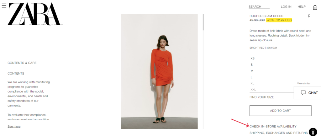
Zara has many stores around the world, they offer checking the availability by entering your location
Promotions and discounts
If the product is sold at a promotion or at a special price, you should specify:
- Regular cost
- Promotion price
- How much the buyer saves

Zara indicates savings in percentage
Size and dimensions
If you sell clothes and shoes (or other applicable items), the product page should contain a size guide. This element should reflect the appropriate product in the right size and open in the same window to ease viewing.
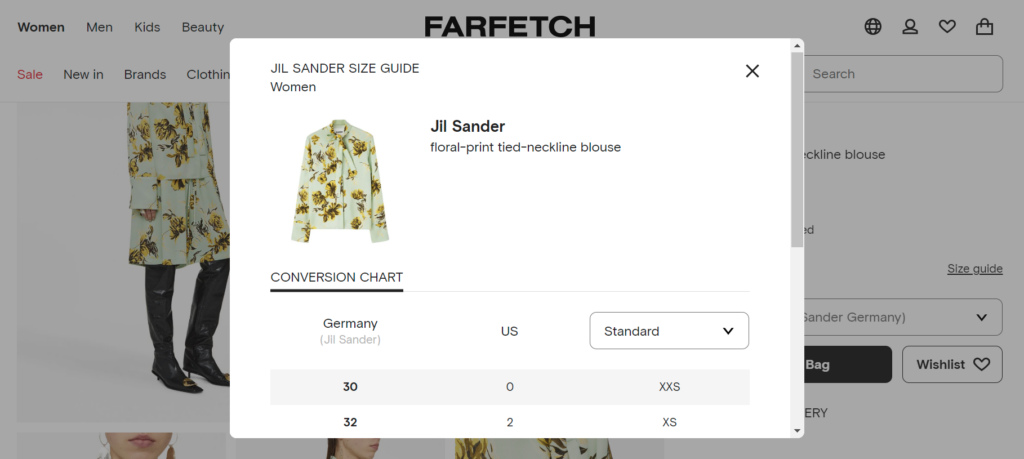
On Farfetch, the Size Guide opens as a popup window
Options
If there is a large assortment of items, it is a good practice to provide a choice for the buyer without going to another page. You can do this in the form of thumbnails or a drop-down list. Options give you a number of benefits:
- Easy navigation through options
- Efficient search throughout the marketplace
- Attracting a visitor with photos in the catalog
- Understanding what range is offered
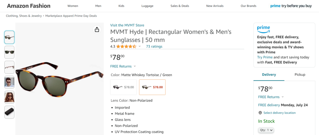
Amazon shows options with prices
Shipping, Guarantee, and Returns
By specifying detailed information on delivery options, guarantees and returns on the product details page, you give the buyer confidence in the safety of the purchase. It is important that the client knows not only about the delivery time, but also the cost of delivery. Try to embed the cost calculator on your platform.
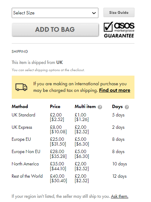
ASOS informs about shipping in days based on automatic location identification
Additional elements
The right time for upsale is when the user is ready to order the product. At this point, the marketplace should recommend making another purchase. To do this, the product card is supplemented with the elements “Make it a bundle”, “Popular products”, etc. In this way, you can increase the average bill. Adding end-to-end blocks with seasonal products allows you to focus on specific products and increase conversions.
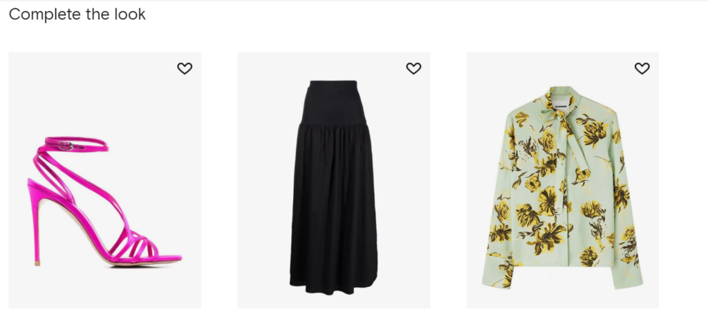
Farfetch offers to complete the look
Reviews and details
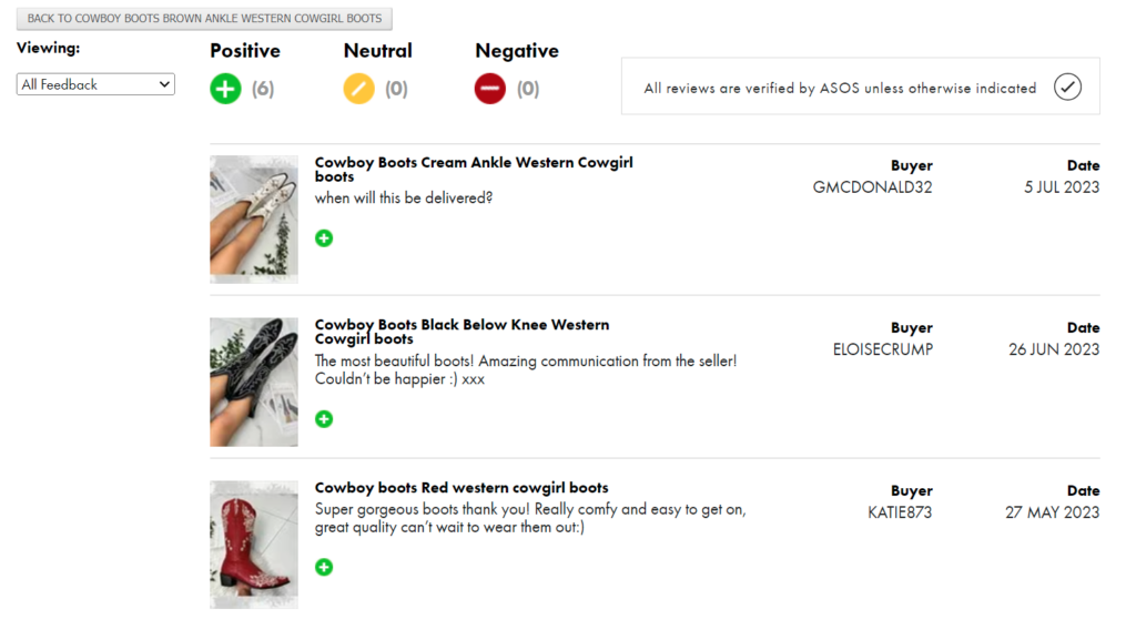
ASOS offers consumers to leave their feedback with the ability to attach a photo
To make the product page for the marketplace as customer-oriented as possible, you need to supplement it with reviews and detailed information. Positive reviews and ratings push a person to buy, because if someone takes it, then “I need it too”. It is necessary to make sure that the detailed description is reflected in the product card, and not taken out separately.
Also, be sure to show all the extra details that may be useful. If your store has a “Best Price Guarantee” promotion, mention it on the product page.
20 Requirements For the Ideal Product Page
We have considered only a few of the basic components of an ideal product page. To improve your marketplace product page, check the following:
- The product name should be clear and attractive.
- Photos of the product must be of high quality, clear and show the product from all angles.
- The price of a product should be immediately visible and easy to compare with other products.
- The description of the product should be detailed, but concise, describing the main characteristics and advantages of the product.
- Indication of the availability of goods in the warehouse or the possibility of pre-order.
- Dimensions, weight and other technical characteristics of the goods.
- Information about the brand or manufacturer of the product.
- Warranty conditions or the possibility of returning the goods.
- Feedback or ratings from other buyers.
- Shipping and pickup information.
- Payment options for goods.
- Goods expiration date (if applicable).
- Instructions for using or assembling the product.
- Certificates of quality or conformity of goods.
- Examples of product use or recommendations for use.
- Related products or accessories that may be purchased with the main product.
- Information about the environmental or social responsibility of the manufacturer.
- Possibility to leave a review about the product.
- Links to social networks or the manufacturer’s website for more information.
- A clear and intuitive system for evaluating and comparing a product with other similar products.
Jane, Lead Designer at Simtech Development:
I would advise using bright, clear and realistic images of the product, preferably from different angles, I would also like to see this item in the interior (if we are talking about furniture), or what can be prepared from this product and how to serve it (if we are talking about food), I think that all this makes the buyer loyal to the product, and they ultimately buy the product.
Case Study – Urbankissed
We helped to customize a fashion marketplace, Urbankissed. Sofie, the owner, developed her online business very quickly, now there are more than 100 sustainable brands on her marketplace. The product pages of sellers can serve as examples of how to create selling product card designs.
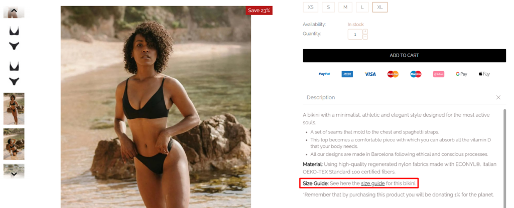

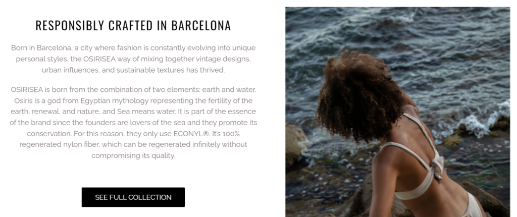
How to Audit Your Own Product Page
To audit your own product card, you can follow these steps:
- Determine what to review: Decide what you want to test or improve on the product page. For example, you can check the accuracy of the information on the card, its attractiveness to buyers, or its compliance with SEO requirements.
- Gather data: Gather all available data about the product card, including description, images, prices, features, and customer reviews.
- Check the accuracy of the information: check each item of information on the product card for accuracy. Make sure the description is true, the images are up-to-date and the customer reviews represent real opinions.
- Assess the attractiveness to buyers: evaluate how attractive your product card is to potential buyers. Consider design, composition, color scheme, and usability. Try to imagine yourself in the role of a buyer and ask yourself the questions: “Would I be interested in buying this item based on the item card alone?” and “Is it possible to make the product card more attractive?
- Check SEO Compliance: If your product card is hosted online, make sure it is SEO friendly. Check if it contains keywords, meta tags, a unique description and other elements that will help improve its visibility in search engines.
- Compare with competitors: compare your product card with your competitors’ product cards. Evaluate what they do better or worse, and try to apply these lessons to your product card.
- Make the necessary changes: based on the results of the audit, make the necessary changes to the product card. Update the description, add new images for the marketplace cards, correct inaccuracies and optimize it for search engines if necessary.
- Track results: After making changes, track the results. Measure what changes in the product card lead to improved sales or other positive results. Make additional adjustments if necessary.
Auditing your own product card is an important step to create selling cards for the marketplace in the future: improving its effectiveness and attractiveness for buyers.
Conclusion
The Simtech Development team has been developing cards for the marketplace for over 18 years. We will help you quickly adapt your product page to current trends, optimize your current design, add new blocks, drop-downs or pop-ups to reduce abandoned carts and increase conversions.
