As technology is advancing, user expectations are also taking a leap. You have to keep your finger on the pulse of eCommerce design trends to have a strong digital presence and inspire a love for your website with your clients.
With this in mind, we’ve picked out some of the most prominent graphic and UI/UX design trends that are shaping the present and the foreseeable future of eCommerce.
Graphic design trends for 2023
The year 2020 is the year of contradictions. In graphic design for websites that means directly opposite solutions are welcome! Minimalism or exaggerated maximalism, ecologically sustainable design vs supernatural or even comic art and postmodern. You can apply calligraphy or highlight your store’s uniqueness with bold typography.
One of the most appealing features is the joint use of 3D and 2D. Our designers have made use of this trend for our own website.

Independently of what extremum of design you choose, keep your website’s look-n-feel vivid and actionable. It is possible using such UX/UI elements as animation, video, interaction features. Show your visitors that you care about them to inspire love and trust.
UX/UI design trends for 2023
Accessible web design
The Internet isn’t always “one size fits all.” Every day, inaccessible web design prevents billions of people in the disabled community from an easy online experience.
Among some of the most common categories of impairments that challenge customer experience are:
- Visual Impairment,
- Hearing Impairment,
- Motor Skills/Physical Disabilities,
- Photosensitive Seizures,
- Cognitive Disabilities.
Back in 2004, nobody knew about web accessibility. But over the last years accessibility has made tremendous leaps and bounds. A growing number of eCommerce sites are becoming disability-friendly. These websites communicate a love message to their customers. Their well-thought featured design shows care and attention to the website visitors.
Assistive technology example
For a marvelous example of a site that uses accessibility’s assistive technology that enhances the customer experience for people with disabilities, take a look at Toys”R” Us:
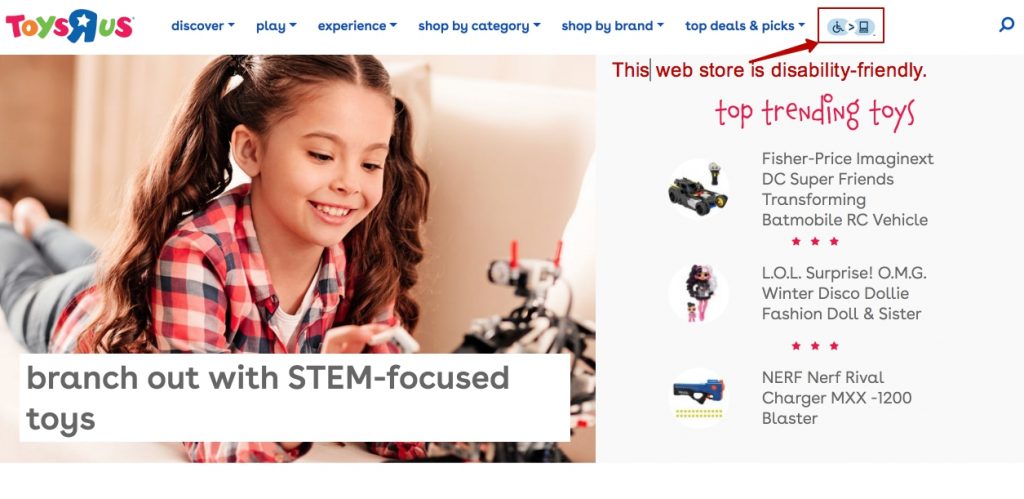
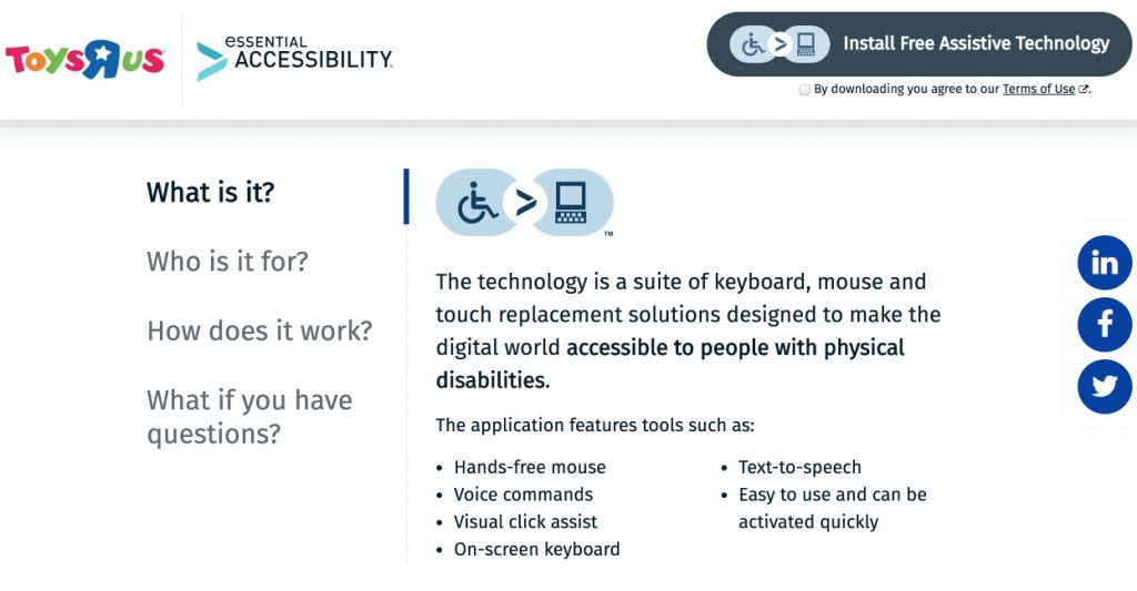
Toys”R”Us use a variety of assistance technology to make their site accessible.
UX/UI design tips
Here are a few things you can implement for your website:
- Website color management for color blind people,
- Descriptive alt tag for images to help people with visual impairment to acknowledge what the image is,
- Keyboard-friendly storefront theme for people for whom using a mouse can be challenging,
- Video subtitles for people who are deaf or hard of hearing,
- Wide clickable areas for people with mobility problems.
Forms can be also frustrating. The longer the form, the greater the risk of making a mistake. And for many people with disabilities, inputting data takes longer and more mistakes are made.
However, more and more eCommerce sites tend to put a lot of energy on making their forms easy to use, especially for the disabled.
When buying books online, I simply enter my social security number in the checkout and all other form fields get prefilled. It’s super easy!
– Woman with Rheumatism
To help website owners make their content more accessible, the Web Accessibility Initiative has created Web Content Accessibility Guidelines (WCAG). Currently at version 2.1, these guidelines focus on a wide range of principles which ensure all people can use a website.
If you are considering implementing accessible elements in the UI/UX of your store, our latest developed storefront theme Gen Z might be a great find.
For this theme, our developers completely redesigned the hierarchy of product categories making more categories visible and accessible as customers browse. It also offers interactive keyboard navigation on site as an alternative to using a mouse for users with motor disabilities.
Read our interview with the front-end developer to learn more about how the Gen Z theme was created and its other UI/UX improvements.
Microinteractions and animations
Microinteractions are moments where the user and design interact. To be precise, these small and subtle interactions with a website – such as transition animations and confirmation messages – make the experience positive and efficient while keeping the navigation simple and intuitive.
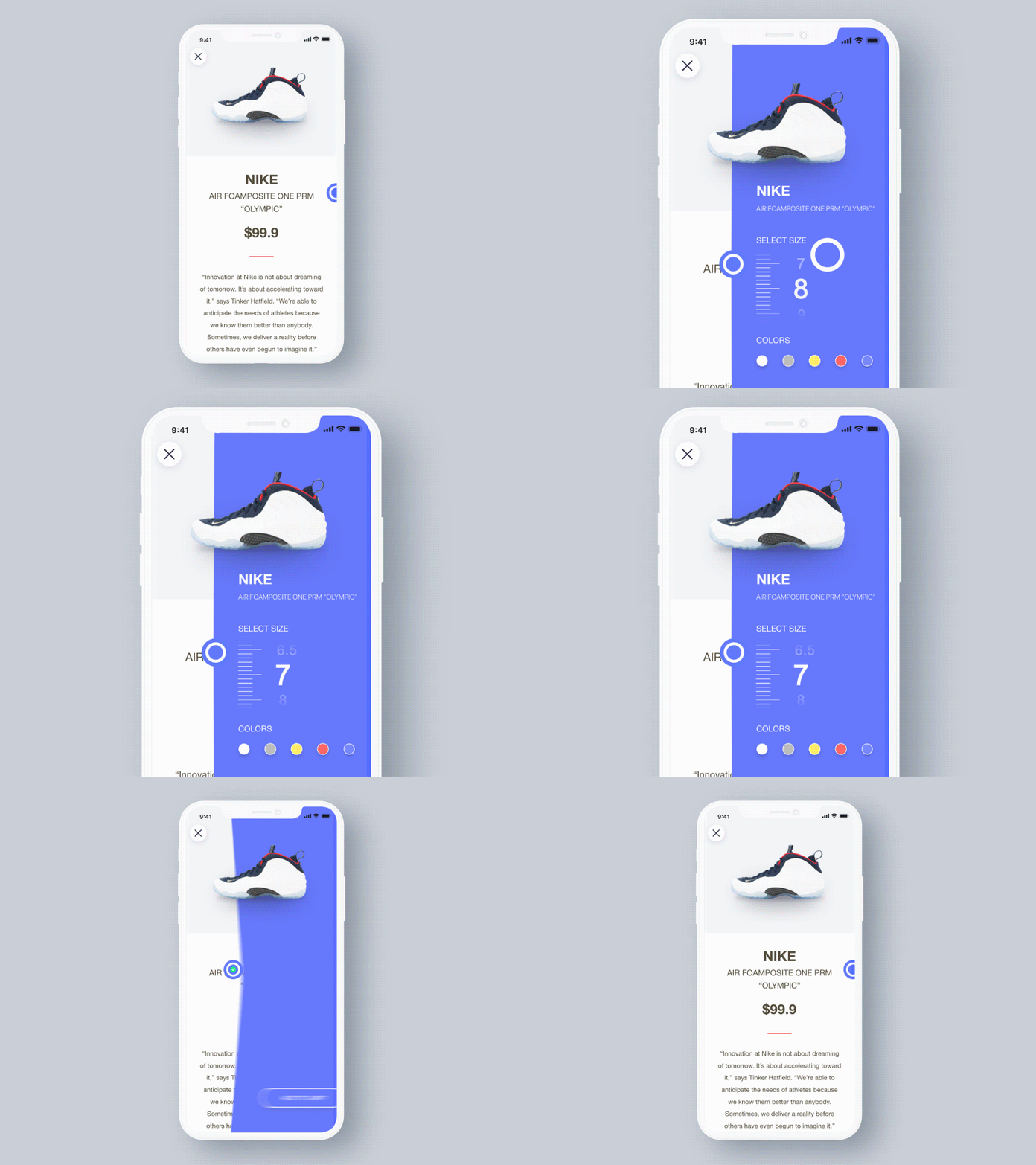
Though microinteractions aren’t a new phenomenon, in 2020 they’ll be much more popular since they bring practical benefits to the user experience. In 2020, animated buttons, scrolling visuals, toggles, and switches gain momentum. Such microinteractions increase usability and help users easily navigate. For example, they show the system status (so users know what’s going on), highlight changes, keep context, visualize input, etc. Use this powerful technique to delight a user.
Check out Apple webpage for new Macbook Pro. The scrolling experience down the page completely surreal!

Customers love microinteractions and have come to expect them. Motion is an integral part of the interaction experience in years to come.
Dark mode
Dark mode switches the background of a mobile operating system to black, reducing eye strain in some environments, enabling mobile devices to better adjust to ambient lighting conditions, and (since black pixels on a mobile phone are turned off) extending battery life.
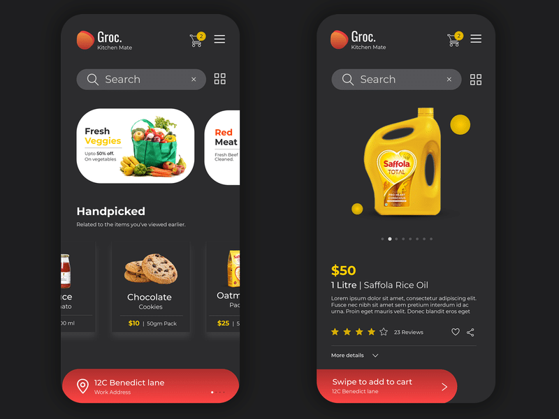
Earlier this year, Apple introduced “dark mode” in iOS 13. Google added its dark mode in Android 10.
In response, for most of the year mobile app developers, designers at social media sites, and just about everyone in the design community have churned out “dark mode” versions of their apps and websites.
It is expected that dark mode will become “ubiquitous” in 2020, extending to eCommerce website design and eCommerce app interfaces.
You can see “dark mode” toggles at the top of popular retail sites and eCommerce apps that inherit dark mode settings from the operating system.
Visual storytelling
People do not have the time to read through a thousand words to get the general idea of how great your product is. This is why in addition to making the text readable, you should consider conveying your message without words.
As creatures that consume most of the information about the world visually, we can interpret pictures way faster than words.
Using visual storytelling on your website makes it easier for visitors to get the main idea. Here’s how can you leverage the power of visuals to tell your story to the customers:
- Show a video
- Use motion pictures
- Support text with images
Here’s an example how a motion image tells a story with the help of the visuals:

Mobile-friendly design
Traffic from mobiles to eCommerce websites exceeds 50 percent of overall online retail traffic. To benefit from this mobile shopper traffic, a CS-Cart store/marketplace owner can refer to our Mobile Layouts add-on. The add-on helps to customize and tailor your website mobile design to fit the mobile audience preferences. You can navigate them easier to the checkout page by excluding some distracting blocks (like similar products) from the mobile version. Mobile Layouts turn conventional desktop layouts into custom ones based on device type.
Recently, we’ve developed a mobile-tailored app. We called it PWAjet as it combines progressive web & single-page application. The app was built with the care about mobile users who can add any CS-Cart based store using PWAjet app to their mobile home screen, choose one of the available trendy color schemes, benefit from well-designed navbar and more. You can explore PWAjet mobile CS-Cart theme reading these articles:
What Is PWA? Introduction And Advantages For Online Store Owners
Meet PWAjet, The First Simtech Development Progressive Web App!
Closing words
In today’s post, we have covered the most popular UI/UX design trends that are just unpacking in the world of eCommerce.
The choice of whether to redesign your website is yours, but the ultimate advice goes as follows:
Implement what works better, but always keep your style consistent. One sure way to accomplish this is using A/B testing. Experimentation is the best way to optimize performance and improve the user experience. After all, UI/UX are based on understanding human psychology and people’s needs.
Paying attention to the UI/UX when managing an eCommerce website can help you create a delightful user experience and encourage people to stay loyal to your brand for a long time.
It’s time to transform your business!
