Today, we are interviewing Simtech Development designers. We will find out what challenges arise while working with client projects, how best to interact with the web design team to get the expected result, and what design trends will be relevant in 2022.
Natalia Evgenia
What difficulties or features arise in the work of a designer?
Most often, designers point to the problem of communication and understanding. Communication between you and the designer is important to ensure that all terms and goals are understood correctly and unambiguously. In addition, communication is important for clarifying requirements and adjusting the assignment as the design develops. It is important to understand that one designer cannot create a “selling” design. Collaboration is the key. The customer better knows the specifics of the business and can guide the designer in the course of work.
Natalia: To make it easier to work with a designer, you need to realize that design does not determine sales on the site. Sales depend on how useful the product is for the consumer, and how interested the user is in it. That is, content is primary, and we (designers) are content architects. Therefore, in order for the work to go well, you should provide content to the designer. To define the content on the site, try to formulate what you want from your site: what goal are you pursuing, what “pain” of the user do you solve. In other words, you need to decide on the purpose of the site, answer the designer’s questions (fill out the brief), and cooperate. Experience shows that when you delegate the entire work on the site to a designer or manager, then, after a certain amount of time and effort, there always come changes that could have been avoided, saving your money and the designer’s time.
Evgenia: Most often, difficulties in work arise due to problems with terminology. For example, when designers talk about a prototype, they mean an animated mockup, while customers or colleagues mean just a mockup, without animations.

*Editor note: Animated prototype is a clickable layout where you can click buttons and links and navigate to other pages. The customer receives such a layout for acceptance of work and approval of the design.
What are the common mistakes? what are they connected with?
Our designers see the causes of design drawbacks in the unclear specification, as well as in the absence of “course correction” – regular communication with the designer about changes in the project. Therefore, it is important not only to agree on a design specification and make sure that both parties are on the same page, but also to keep constant contact with the designer.
Natalia: One of the mistakes is that a designer can immediately focus on “beauty” without thinking about the logic of the store from the very beginning, if we are talking about online stores. First you need to understand what kind of store it is, for whom it is, what needs the users of this store have. Please note: not your needs, but the users’ ones.
A mistake of our customers is often ignoring the job done by designers. From my experience, I can say that the designer and the customer need to call each other once a week, demonstrate the work progress, and correct the course. Then the processes become more efficient. You are in the course of what is happening, understand at what stage the project is, and what will be the next step. This is comfortable for each party and helps avoid unnecessary edits.
Evgenia: Most often, errors occur when a clear technical specification was not initially set, then in the process of work there are improvements like “Add a button here, but no, it’s better to remove it, no, it’s better to add … and so on”
What should the client pay attention to when accepting work?
Natalia: Check if the site structure corresponds to the pages listed in the specification, the design was made in accordance with your requirements, and all changes were made.
Evgenia: First of all, make sure all pages are in place, then check the indents, fonts, colors, so that everything matches and nothing jumps. If a prototype is included in the design, then you need to go all the way from the beginning to the last step. This is the only way to be sure that you haven’t missed anything.
What are the current design trends? Which ones do you personally use?
Simplicity and minimalism remain in vogue. To add variety, you can use neon. Trust UX professionals who design the site according to user behavior patterns in the online store to take advantage of the trends.
Evgenia: Recently it has become fashionable to use hologram and neon in graphic design, it is also always nice to look at minimalism.
Natalia: Cleanliness and order are the main trends. Research in the field of UX design suggests that the design should not be primitive, a certain complexity should be kept, and the site architecture should also be clear and intuitive: users should immediately get where they are and why, what benefit they will receive, what is that benefit.
We know the user behavior patterns in the online store, understand where and why the user wants to go, and draw our design in accordance with these patterns.
What to prepare to make it easier for the designer to complete the task?
At the very beginning, it is very important to orient the designer about what things to be done. Here, all the materials you have will come in handy. Do you have an analysis of competitors and target audience? Good! The company has developed a brand book and a logo. Provide them at the start. Do not forget to share your vision of the project in order to be on the same note with the performer of the work.
Natalia: It’s great when a client joins the calls, answers questions in detail, and thus participates in the work. If the customer has a logo / brand book, etc., then it must be transferred to the designer. Also a list of competitors, with a description of what they like and what is better to avoid. References of what you like with comments why you like it. Any information can be interpreted in different ways. For example, a customer likes the palette in the menu on some site or how the menu items stand out when interacting with it, but did not tell the designer about it, or simply sent a screenshot of the page. How can a designer understand what exactly attracted the customer on this page? Communication is always required.
Evgenia: The more information there is at the initial stages, the faster and better the work will go. I always ask if there is a brand book or some kind of vision of the result. This helps to quickly build a system and understand the needs. Of course, additional research will only be a plus in the work, especially at the initial stages.
Share your best cases with us
Natalia: I think that all our projects can be called successful, because we help the client to open their own business, start selling, and earn money.
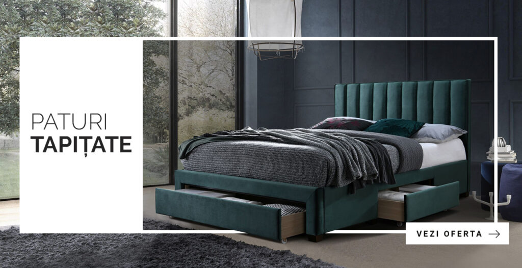
Evgenia: It is difficult to choose one case. In my opinion, the Kalenda furniture store was the most successful for me. The store owners are from Romania, and we were an exact match. We discussed the design a lot and to the point, they gave me all the materials on time (brand book, icons and some of their developments, content and photos).

The most motivating thing is that each time you have to do different tasks, that is, the work of a designer requires you to be constantly aware of all the events in the world of technology, art and culture in general. The world is constantly changing, and design also does not stand still, one has only to compare the Internet as we saw it in 2000 and now, and the thought that everything will change ahead is very exciting.
Evgenia, designer at Simtech Development
Findings:
- Give detailed answers to the questions in the brief. Although not mandatory, this document greatly helps to understand the specifics of the site and other background information. The brief gives the designer an initial understanding of the direction in which to move.
- Provide additional materials so that the designer understands the task better. It can be a brand book, a logo, a list of competitors indicating the elements you like, examples of sites (also mentioning what you like).
- Hold regular meetups with the designer, for example, once a week, to keep abreast of the work and adjust the direction, if necessary.
- When accepting the design, pay attention to the presence of all pages, indents, fonts, colors, the entire path of the client according to the prototype, the compliance of the site structure with the pages listed in the specification.
- Don’t chase design trends, but trust professionals who know behavior patterns and can adapt your site’s content to them so that the design serves not only to attract attention, but also guides the client through the site, helping them find what they need and make a purchase.


