Today, let’s consider some basic advice to improve the usability of the shopping cart and the checkout page in an online store. Hopefully, you have already implemented this advice on your website. If not, now is a good time to improve your checkout process so you can increase conversion of sales for your store.
Here are the top 8 reasons why shoppers abandon their shopping carts.
1. Hidden extra charge
According to Baymard, 55% of online shoppers refuse to complete their purchase from a site if they discover some hidden price.
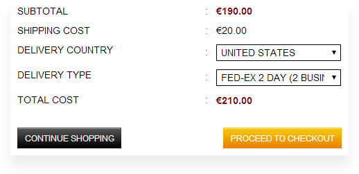
Unexpected additional charges during the final checkout step—such as a shipping fee or implicit tax — is the leading reason why shoppers abandon their shopping cart. Other unpleasant surprises are a much longer delivery time and out-of-stock items. To prevent disappointment, let your customers know about any additional fees or other things that might affect their purchasing decision as soon as possible.
Free shipping is the most important benefit for customers. Often this factor affects their final choice about which store they will use to purchase items.
2. It’s hard to find a cart
A shopping cart is an easily-recognized element of an online store. The cart must be posted in the traditional location on your website and it must have a standardized look and feel.
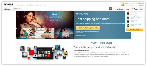
Visitors should be able to see the cart on every page and the cart icon should always be located in the upper right corner of the screen.
Do not make the cart icon look like a banner. When used in this way in combination with other banner-like information the cart is nearly invisible on the page (banner blindness).
A cross-cutting mini-cart should always show the items that have been added to the cart and the total amount of the items to be purchased. Real-time synchronization with the customer’s actions is necessary (i.e., the number of positions and the total amount should be recalculated after the customer has added or removed an item).
Is the cart empty? A good way to display the empty shopping cart is to post a message about a gift that is already in the cart. Let customers know that their purchase comes with something extra, like additional service, samples, or souvenirs with your logo.
Another option is to place a message about a daily discount or a free shipping offer next to the empty cart. If you don’t want to give a discount or spend money on customer gifts, provide a link to the instructions: “How to place an order”.
3. Unclear cart page
The cart page should provide the customer with complete information about his or her purchases.
It’s best to use a table structure for a cart page. Use standard fonts and simple elements. Every new product should be visually separated from the previous item. Each item should have a picture, a name, and a link to the detailed page that opens in a new browser tab.
Baymard says, the ideal number of elements on the checkout page is 12. So, don’t overproduce elements.
4. Uneditable shopping cart
The order should be easily changed within in the cart. You should enable your customers to edit selected products — remove items, add or reduce the number of identical items, change a color or a size — without returning to the catalog.
The cart should update without having to reload the page. The shipping rate should automatically be recalculated.
The ASOS cart meets the criteria listed in reason 3 and reason 4. This cart offers customers the opportunity to purchase up to the amount that is needed for them to enjoy free shipping.
5. Unclear navigation when placing the order
27% of customers bounce for the only reason of a too tricky checkout process.
A checkout process is often implemented in one of the following ways:
- A step-by-step mastery of several consecutive pages;
- One-page checkout (the customer has access to information about all the products he or she is purchasing and the fields, such as credit card information, shipping address, etc., they must fill in).
For the first option, the process should involve three or four steps. Do not forget to show your customer a current and completed stage. The user should be able to return to any step at any point and change the data.
Try to avoid using common words on the buttons (e.g., “Next”). Use a specific message to indicate a future action, like “Proceed to Checkout”.
6. To place an order by phone
We recommend that you add your manager’s contact information, like a telephone number, in a visible place on the checkout page (for example, through a call-back button). This will increase the number of purchases at the checkout stage because customers will be able to speak to a company representative to get answers to their questions before completing their purchase.
One more tip here for you is to add a clickable phone number at the page header. The practice of our clients shows that most online stores have a phone number in the header but for some bugs it is not clickable. Check it out on your website in order to not to loose your customers for this unfortunate error.
7. Unsaved current cart state
Most of customers who visit stores for the first time don’t purchase products. Usually they look for the best price and use your cart to store favorite products (like “Favorites” in a browser). They come back in a week and sadly discover that the shopping cart is empty. The length of time it takes for a customer to return can vary from several days to months. That’s why we recommend that you increase the cookies storage period.
8. Complicated registration
The required registration is another common reason that customers leave the shopping cart without completing their purchase.
Provide the customer with several options for the checkout by offering one-step registration. Add some benefits for registered customers, like bonuses and discounts.
Add authorization through social networks. This will enable you to get some useful information about your customers that will make it easier for them to fill out of the registration forms.
Summary
In this article we have tried to address the top 8 reasons why customers abandon their shopping carts and to provide key recommendations that support shopping cart usability. But, it’s only a fraction of the advice that can be given. Obviously, the reasons why the conversion rate is not so high can be multiple and depend on many factors. But these are the common ones. Check it out on your CS-Cart based store, and if you need assistance, we can always inspect your website to give you a clue on how to set up it correctly for better conversion in terms of code review.


