From our previous article, we learned how to calculate conversion rates. This article shreds the light on ways to improve the conversion in online stores and marketplaces. We asked our lead marketer to share his recommendations to improve this metric for eCommerce websites.

1 Usability audit
Conducting a usability audit helps in isolating bottlenecks of your site that scare away visitors and worsen conversions. This includes analysis of navigation, page loading speed, usability of forms and other interface elements. Usability analysis is a collaborative effort involving various stakeholders to ensure a user-centered design approach. Audit the usability of your site at least once a year. Regularly incorporating usability analysis into the design and development process helps ensure that the system remains user-friendly and meets the needs of its users.
2 A well-organized website structure
A well-organized website structure will help visitors quickly and easily find the products or information they need. Dividing products into categories and subcategories, using the navigation menu and site search – all this will help improve user experience and increase conversion rate. We recommend conducting competitor analysis to check what else can be improved.
3 Smart emails
Sending regular smart emails that contain personalized offers and recommendations will help keep customers’ attention and encourage repeat purchases. For example, you may want to remind a potential customer about an “abandoned cart”, thus pushing the customer to action. The simplest option is to email “You forgot something”.
Work with your current client base simultaneously through mailing lists and instant messengers. The conversion of such customers into a purchase is likely to be higher because they are more loyal, since this is not their first purchase. Make special promotions for regular customers, divide customers into segments so that your offer hits the target.
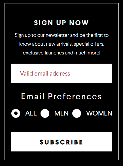
Northskull considers gender while offering subscribing for their news
4 A call to action
Using effective call-to-actions on your website and promotional materials will help visitors take the necessary action, such as placing an order or signing up for a newsletter. Examples may include:
- “Start your free trial and see the difference for yourself!”
- “Donate now and make a difference in someone’s life!”
- “Request a demo and discover how our product can revolutionize your business!”
5 Lead magnets and pop-ups
The use of lead magnets (value-added offers or content in exchange for contact details) and pop-ups significantly increase the conversion from lead to sale.
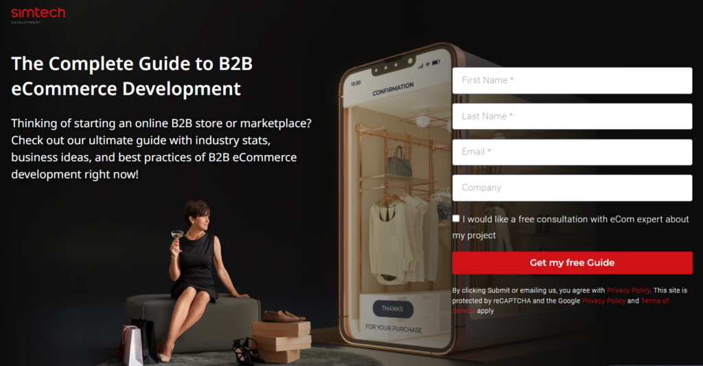
Meet our B2B guide. Download it for free!
6 Improving traffic quality
Optimizing your traffic acquisition channels will help you generate visitors who have more potential to make purchases. Analyze and optimize traffic sources to attract better target audiences and increase conversions. Here are three important GA4 metrics for evaluating traffic quality:
- Bounce Rate: measures the percentage of single-page sessions where users leave your website without any further interaction. A high bounce rate can indicate that the traffic you’re receiving may not be relevant or engaging enough for users. Monitoring and reducing bounce rate can help improve traffic quality by ensuring that users are staying on your site and engaging with your content.
- Pages per Session: measures the average number of pages viewed during a session. Higher pages per session indicate that users are exploring more of your website, which can be an indicator of quality traffic. Monitoring this metric can help you understand if your traffic is genuinely interested in your offerings.
- Average Session Duration: measures the average time users spend on your website during a session. A longer average session duration suggests that users are finding your website valuable and are willing to invest their time in exploring it. Monitoring this metric can help you identify if your traffic is genuinely interested and engaged with your website.
7 Video content
Using video content on your site will help improve user experience and build trust in your brand and products.
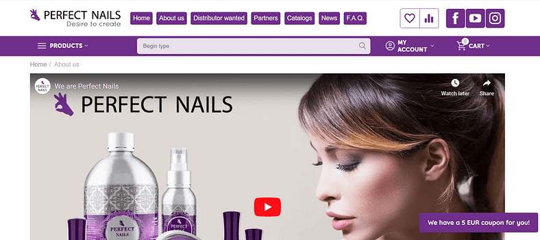
Our client – Perfect Nails – is building a strategy to promote the services of its masters on YouTube videos. The company is a major distributor of nail products and offers master courses directly on their website (the link to the course leads to their YouTube channel)
8 High-quality product photos
Providing high-quality product photos from multiple angles helps potential customers get a better idea of the product. Here are some tips to help you capture great product photos:
- Lighting: Ensure you have adequate lighting to avoid shadows or dark spots on your products.
- Background: Choose a clean and simple background that doesn’t distract from the product.
- Composition: Frame your product appropriately, highlighting its key features.
- Focus and sharpness: Use a tripod or stabilize your camera to avoid any blurriness.
- Props and styling: Use props or styling elements to enhance the product’s visual appeal.
- Editing: Post-processing is essential to enhance the overall look of your photos.
- Consistency: Maintain a consistent style and aesthetic across all your product photos to create a cohesive look for your ecommerce store.
Creating high-quality photos for an ecommerce store is crucial, as it directly impacts the perception of your products and ultimately affects sales.
9 Infographics
Using infographics to visualize information about a product or service will help grab the attention and provide detailed product information.
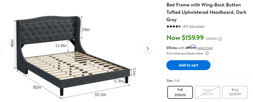
Walmart infographics
10 Clear and simple product descriptions
Writing informative texts and descriptions that are focused on the needs and interests of customers convince them to make a purchase.
11 Convenient shopping carts and checkout
Note how easy it is to place an order on your website. Most often, customers leave here. Even if the product is liked, the checkout process can be too complicated, and customers opt for a competitor store. For each field in the order form that needs to be filled out, you can set an event in Google Analytics, build a funnel of such events and understand where the purchase process is interrupted most often. After making a purchase or before leaving the site, offer the visitors to answer whether the site is convenient. It may happen that your clients will point to completely non-obvious problems.
Creating a clear and concise cart page is the task number one of any eCommerce site. Make sure your shopping cart doesn’t turn off shoppers.
Simplifying the checkout process and improving the user experience in the shopping cart will help reduce bounces at the checkout stage and increase conversions.
12 Disabling mandatory registration
Simplifying the checkout process by disabling mandatory registration can increase conversion rate, as many visitors don’t want to take the time to create an account. Here are some recommendations and examples of how to disable mandatory registration:
- Provide guest access
- Offer the option for users to log in using their existing social media accounts
- Implement temporary or single-use accounts for making a purchase or accessing specific content.
- Implement a progressive profiling approach: Gather essential information gradually over time as users engage with the platform.
For example, Amazon allows users to make purchases without creating an account by providing an option to check out as a guest. A temporary account is created for the transaction, and users can choose to save their information for future purchases.
13 User-friendly search
Implementing a convenient search function on your site will help visitors quickly find the products they need and simplify the buying process. Modern solutions allow you to prompt the user with the necessary options, even if they made a typo, or their requests don’t fully match the name of the product. Implement smart search functionality that eliminates ‘Nothing Found’ results, offering an alternative to the buyer.
14 Running a blog
Keeping your blog updated with helpful articles and product information can bring more visitors to your site and increase the likelihood of a purchase. Write articles with tips on product choices and make top (or seasonal) product lists out of the best products from different categories – all this gives a significant increase in conversion traffic.

Urbankissed created a separate blog page to recommend Looks
Ensure that your blog articles are linked to the catalog for visitors to find a specific product, category or promotion page.
15 Motivation for employees
Motivated employees, especially your sales team, provide better customer service, which impacts sales conversions. Develop a reward system that encourages employees to achieve goals. This includes attributing bonuses for exceeding goals. For example, our company developed a branded gift shop for employees. “Payment” for the commitment of the company is made in simtech-coins, which are being exchanged for branded apparel or household items.
16 Affiliate or loyalty programs and discounts
Introduce a loyalty program to stimulate repeat purchases and retain customers. Develop attractive and valuable rewards for loyalty program members. These can be discounts, bonus points, gifts, exclusive offers or access to special events.
In our practice, there was a case when we introduced an Affiliate program for an Australian marketplace. We helped promote the partnership between UNIXMO and the New Zealand Automotive Repair Industry Society, “Capricorn”. One of the components of the program was discounts to customers if they and their vendor are members of the Capricorn Society.
Offering special promotions, discounts or gifts encourages customers to make a purchase. Be careful with this – too much attention to gifts can make the business work “in the red.”
17 Optimized mobile version
It is crucial to have a mobile-optimized website as more and more people shop using mobile devices.
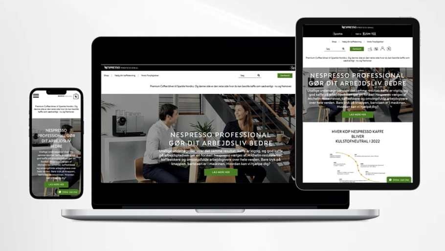
Mockups adapted for mobiles created by the Simtech Development team for Nespresso (Switzerland)
18 Contact Us page
Contact information placed on a prominent place on the website will help visitors to contact you in case of questions or problems. Also, the availability of contact information makes the business more transparent in the eyes of the client. The visitor is sure that they can contact a company representative and get a detailed answer without having to search the site. It is important to include certain elements to make it effective and user-friendly:
- Contact Information
- Contact Form
- Social Media Links
- Business Hour
- Map or Directions
- Frequently Asked Questions (FAQ)
- Privacy Policy
- Call to Action. For example, you can prompt them to fill out the contact form or provide a phone number to call.
19 High website loading speed
High website loading speed is one of the key success factors for an online project. Fast loading keeps visitors on the site, improves user experience and increases conversions.
To achieve high site loading speed, you can use the following methods:
- Image optimization: This includes lossless compression of images, use of smaller file formats (such as WebP), and lazy loading of images. Check out this case to see how we optimized images for a supplier of high-end replacement watch bands.
- Caching: The use of caching mechanisms to store temporarily immutable data on the client or server side.
- Code minification: remove extra spaces, comments and line breaks in HTML, CSS and JavaScript files.
- Using CDN (Content Delivery Network): distributing content to servers close to the user’s location for faster data delivery.
- Server optimization: setting up the server for fast processing of requests, using data compression (gzip), setting up caching on the server side.
- Removing or replacing slow or unnecessary plugins and scripts. Check out one example of such a server “clean-up” here.
- Using Asynchronous Script Loading: Load scripts asynchronously so they don’t block the loading of other page elements.
- Database optimization: removing unused data, optimizing database queries.
- Using HTTP/2: A new version of the HTTP protocol that allows more efficient data transfer between server and client.
- Performance Testing and Monitoring: Regular website speed testing and performance monitoring to identify problems and fix them.
Implementing these methods is a good practice, but difficult for non-technical people. You can trust the job experience of our developers.
Apply these methods to achieve a high website loading speed and improve the shopping experience on your website. Find more examples in our recent article.
20 Up-to-date pricing
It’s important to display up-to-date prices on your website so that visitors don’t feel cheated or disappointed. Make sure the prices of your products or services are up-to-date and prominently displayed so that customers can make an informed buying decision. Also, do not forget about the needs of customers, make promotions for goods that are in high demand during the season.
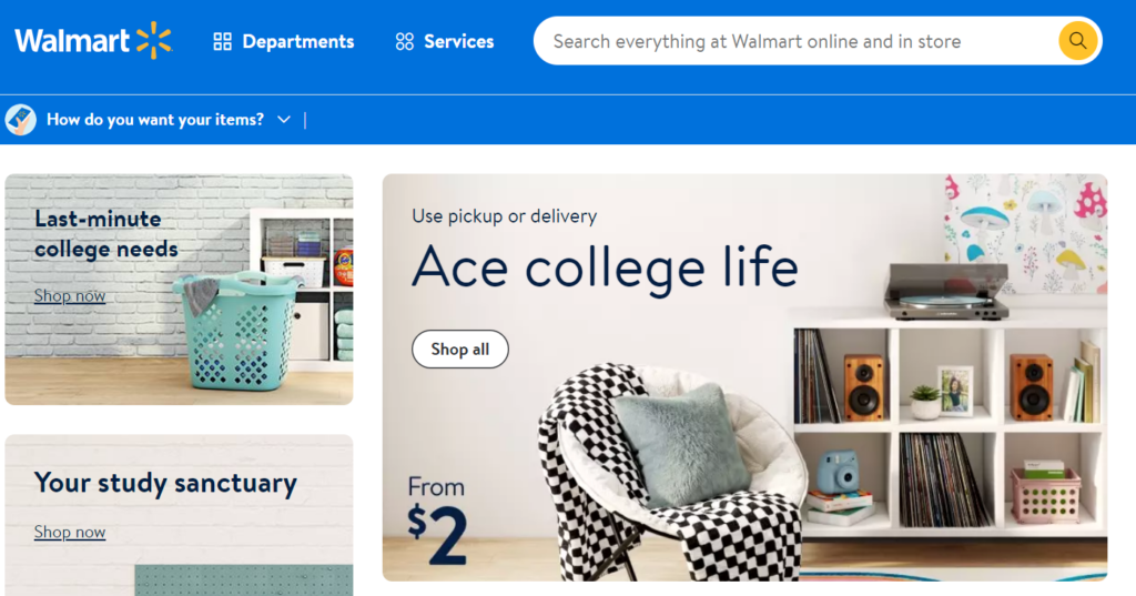
Walmart is a good example of displaying high-season offers
Creating limited-time promotions and emphasizing that a product or offer will run out soon help make a purchase decision faster.
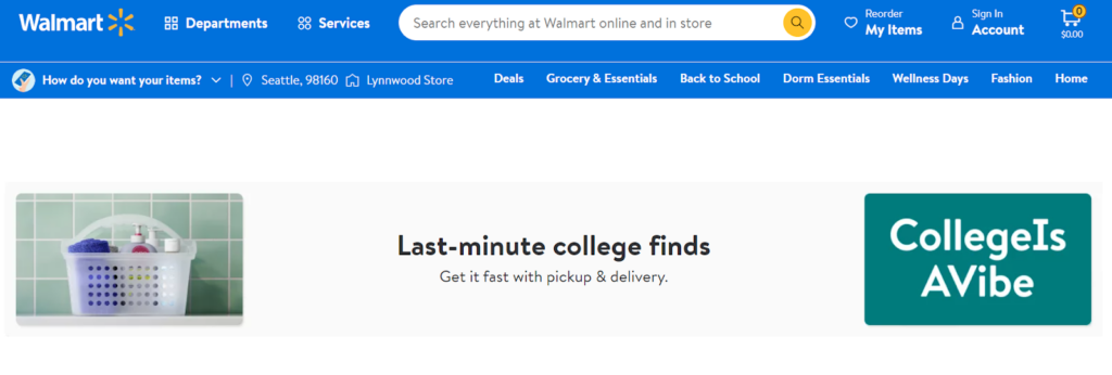
Last-minute special offers on Walmart
21 Offering a discount for sharing a review
Honest and reliable reviews and testimonials will advertise your business. Negative reviews kill conversions on even the best site. Reviews on the site itself rarely inspire confidence, so evaluate your environment – your own social networks and specialized review sites. Just type in the query “reviews *company_name*” into the search bar and see the top 10 results. Do the same with your closest competitors, collect a list of sites and post reviews on them.

Walmart offers to leave feedback
Including testimonials from other buyers can help convince potential customers of the quality and value of your item. Consider writing articles and filming videos with reviews, both on your own and with third-party authors, like bloggers, celebrities, influencers. All this will increase not only the conversion, but also the popularity of certain products.
22 Quizzes
Try running quizzes. Create a small survey that will help both the client and you identify product needs. At the end of the survey, offer the client a discount or bonuses in exchange for their contacts.


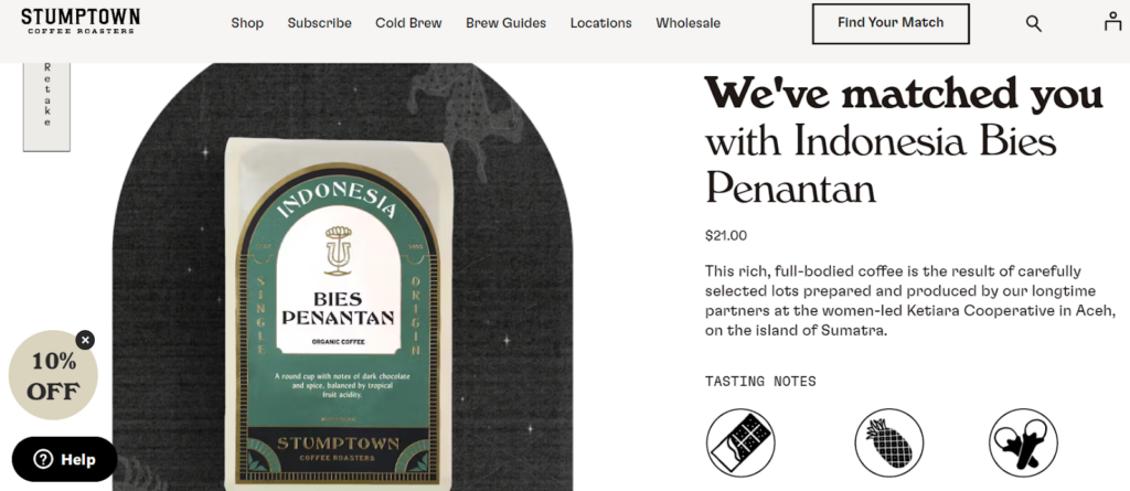
Stumptown’s “Find your match” game: the user answers five questions about their coffee preferences, and get their perfect coffee match at the end of the survey with a 10% discount on this product.
23 Variety of payment options
Providing a variety of payment options such as credit cards, electronic payments, and cash can make the buying process more convenient for customers.

Recently, payments in cryptocurrency have become popular.
24 A well-thought delivery page
Creating a user-friendly and informative delivery page reassures customers that the shipping process is safe and secure. This should include shipping information: what types of shipping are available, what areas or countries are covered, delivery slots, and costs.
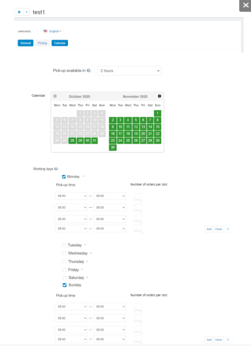
Delivery slots on Choplocal
Also, it’s a good idea to specify the conditions for returning goods or guarantees. If the company works with certain partners or uses certain courier services, you can include their logos, names or descriptions so that buyers have more confidence in the delivery process. Using photos, illustrations, or videos will help visualize the delivery process and build trust with visitors. The user should be able to specify their contact details, delivery address, choose the type of delivery and payment, as well as add comments or special instructions.
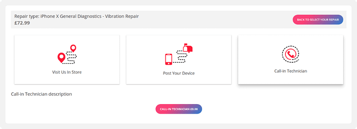
In the Mobile Bitz store (phone repair), the process of choosing the service is visualized. This makes it easier for the user to select an option.
25 User Generated Content (UGC)
Including reviews, photos, and videos from real users convinces other potential customers of the product’s quality and builds trust. Make sure that other users see such content – for example, make it visible in the relevant product cards
26 Security
Providing a safe and secure shopping experience, including the use of SSL certificates and protecting customer data, can help reassure customers that their personal information is safe.
27 Free Shipping
Offering free shipping or more favorable shipping terms is attractive to customers. Set a minimum order threshold to encourage customers to spend a certain amount to qualify for free shipping. For example, “Free shipping on orders over $50.”
28 Personalization
Using personalized recommendations refers to the practice of providing customized suggestions or recommendations to users based on their individual preferences, behavior, or previous interactions. This approach aims to enhance user experience, increase engagement, and improve conversion rates. Try recommending products based on a user’s browsing history, purchase history, or similar items viewed by other users with similar interests. For example, if a customer recently bought a pair of jeans, the system might recommend matching tops or accessories that complement their purchase.
29 Cross-selling and upselling
Offer additional products or services that may be of interest to customers in order to increase the average check and conversion. Display blocks “You may also like” on product pages.
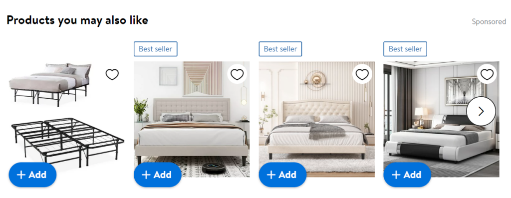
Upselling block on Walmart
30 Custom design
Creating a unique and eye-catching product or checkout page design can help keep customers engaged and increase conversion.

For the online store of halal products, our designer made layouts for the main pages. We managed to implement new functionality: a page with recipes, a blog, coupons, delivery slots and a club of privileges.
31 Social media
An active presence and interaction with customers on social media will generate new customers and improve conversions. By creating and sharing engaging content on social media platforms, such as informative blog posts, product tutorials, or behind-the-scenes videos, you can attract and engage your target audience. This interaction helps build brand awareness, trust, and credibility, ultimately leading to higher conversion rates on your e-commerce site. In addition, social networks can be a full-fledged sales tool.
32 Retargeting
Using retargeting allows you to show ads to potential customers who have already expressed their interest in your product or service, increasing the likelihood of their conversion. Here are some general tips for retargeting:
- Before you start retargeting, it’s essential to know who your target audience is. This will help you create personalized ads that will resonate with them.
- Use dynamic ads that change based on the user’s behavior. These ads have a higher click-through rate and conversion rate than static ads.
- Set frequency caps to ensure that your ads don’t become annoying or intrusive.
- Segment your audience based on their behavior, interests, and demographics. This will help you create more targeted ads that are more likely to convert.
- Test and optimize. Use the data to optimize your campaigns and improve your results over time.
33 Warranty and return policy
Providing warranty and convenient return policy can reassure customers that their purchase is safe. Describe your RMA (Return Merchandise Authorization) in detail to allow the return to be processed smoothly.
34 A/B testing
Testing different design options, text, colors, and other elements on your site pages at each stage of the sales funnel can help determine the most effective options for increasing conversions. Below are some tips on conducting the best A/B testing:
- Define clear goals: Clearly define the objective of the A/B test. What specific metric or behavior are you trying to improve or understand?
- Choose a single variable: Focus on testing one variable at a time to ensure accurate results. This could be a headline, call-to-action, layout, color, or any other element on your website or app.
- Randomly assign participants: Randomly assign participants to each variant to reduce bias and ensure a representative sample.
- Determine sample size: Calculate the required sample size to achieve statistical significance. This will depend on factors such as the expected effect size, confidence level, and statistical power.
- Run the test for an appropriate duration: Allow the test to run for a sufficient duration to capture different user behaviors and minimize any time-based biases.
- Monitor and analyze results: Continuously monitor the test results to ensure the experiment is running smoothly. Analyze the data using statistical methods to determine if there is a significant difference between the variants.
- Implement the winning variant: If one variant outperforms the others, implement it as the default option. However, it is important to continue monitoring the performance to ensure long-term success.
35 Internal linking
Placing links between different pages of your site improves navigation and keeps customers on the site.
36 Constant analysis and optimization
Analyzing data, monitoring metrics, and constantly optimizing your website and marketing strategy will improve conversions. It is recommended to perform regular analysis and optimization of an ecommerce website, ideally on a monthly or quarterly basis. This allows you to stay updated with the latest trends, identify any issues, and make necessary improvements. There are several tools available for analyzing and optimizing ecommerce websites. Some popular ones include Google Analytics for tracking website traffic and user behavior, Google PageSpeed Insights for analyzing website speed and performance, and A/B testing tools like Optimizely or VWO for testing different variations of your website.
Here are some recommendations for constant analysis and optimization of an ecommerce website:
- Monitor website traffic, user behavior, and conversion rates using analytics tools.
- Identify and fix any usability issues, such as slow loading times, broken links, or confusing navigation.
- Conduct A/B testing to test different layouts, designs, or call-to-action buttons to improve conversion rates.
- Optimize product pages by improving product descriptions, images, and customer reviews.
- Implement SEO strategies to improve search engine rankings and increase organic traffic.
- Regularly update and optimize your website’s content, including product descriptions, blog posts, and landing pages.
- Stay updated with the latest industry trends and best practices to ensure your website remains competitive.
37 Follow the trends
Staying up to date with the latest industry trends and changes will help you tailor your strategy.
Conclusion
These tips are relevant for most online stores and marketplaces. If you don’t find a ready-made conversion solution, we can always develop a handy tool that will help you convert more visitors into buyers on your eCommerce website.
