Apple, Walmart, Etsy, Amazon, ASOS, and Zappos are some of the eCommerce companies that mastered the art of building the best shopping cart experience. The key to their success may be owing to their products or services, but not only. All share a common bond: they applied strategies to decrease shopping cart abandonment and emphasize the competitive advantage that differentiates them from competitors.
Here are some quick tips that helped Apple, Amazon, Etsy and other benchmarking eCommerce websites achieve their success in creating the best shopping cart practices. You can apply these principles in your eCommerce platform like our customers on CS-Cart platform did it.
Quick checklist to improve your shopping cart customer experience:
#1 – Place your shopping cart and menu in a visible location

The cart should remain always visible, even without any item in it. Web designers recommend keeping it in a blank header and always in the top right corner as it is the quickest way to access the checkout page where the purchase is completed.
Our Sticky menu add-on has just the same purpose: to make your cart, menu, or other block always visible to your customers. No matter how far potential buyers scroll, all the necessary information will be kept before their eyes to prompt to buy. While you scroll through the product page the sticky bar is displayed prominently, yet non-intrusively. It becomes invisible as soon as you reach the footer in order not to conceal the content.
#2 – Allow visitors to omit mandatory registration

Initial registration simplifies the life of a customer, but it should be a free choice of a potential customer. Don’t put an extra obstacle in their journey and you will see your abandoned cart rates reducing. The collection of customer data before making the payment or specifying the shipping address makes it difficult to complete the purchase. It is better to request this information later. A good practice is to send a second email with the following subject: Are you satisfied with your purchase? Subscribe to get a 20% promotion on your second purchase! This is the most common and easiest strategy to get a consumer lead.
Tips
In CS-Cart you can allow your customers to checkout as guests by default. After they made their first purchase, there is also a possibility to enable such settings as:
Allow shopping for unlogged customers. This setting enables or disables the guests to your store to add products to the carts. Leave this opportunity for unlogged customers and let them sign in later. After successful checkout, you then can offer your guests to create an account. Offer guests to create an account after a successful order. If you enable this setting, the buyer who placed an order as a guest will be offered to register an account afterward.
Play with user group functionality. You can create a user group, call it ‘Beginners’ and add a special promotion for this group members. If a customer registers, the Beginners user group is automatically assigned and the order total is reduced by 5% at the checkout.
Activating these settings, you will encourage your customers to register and get more insights about your buyer persona. But be aware that, all these additional steps in the checkout process should appear only after the customer friction is reduced!
#3 – Make checkout shorter
A good practice here is one-page checkout: all the information such as payment methods, items in the shopping cart, shipping data, is represented on a single page, so that the customer could glance at it. This reduces the customer friction. Another practice which is worth attention is the step-by-step checkout. This is almost the same but the mentioned elements are shown sequentially, in several pages, as the user completes the information.
#4 – Make filling out easier
To speed up the process of submitting forms, remove the facultative data that can be specified later. However, simplifying the checkout process as much as possible, has a limit. Leave the most important information such as payment method, billing data or shipping address (although it can be omitted after user registration).
#5 – Make the shopping cart icon informative

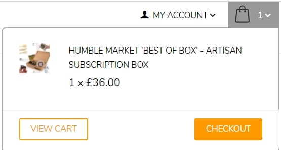
Your cart favicon should display the number of items added to the cart to increase conversion. Additionally, hovering the mouse over the cart may show the cart content and prices. You can also add notifying the user when an item is added to the shopping cart. This visual effect lets the potential buyer know that the item is already in the cart, and is ready for purchase.
And the last thing to remember is that your company favicon should be personal! Don’t forget to turn off the CS-Cart default one and place your own unique logo instead!
Closing
Now, when you have this quick checklist before your eyes, you can start creating the best shopping cart experience. At SimtechDev, we help online retailers to create a better shopping cart experience with CS-Cart shopping cart platform. If you need more information, you can get a free consultation with our eCommerce experts.
